Credits
['lookang', 'kangrui']
Sample Learning Goals
[text]
For Teachers
 |
| link |
Exploring the Power of EJS: Plotting with Plotly
In today's tech-driven education landscape, interactive simulations and data visualizations are powerful tools for teaching complex concepts. EJS, or Easy JavaScript Simulations, is a versatile platform often used in educational settings to create interactive physics simulations. One of its standout features is its ability to seamlessly integrate with libraries like Plotly, a popular graphing library known for interactive plots.
In this post, we’ll showcase how EJS can be used to create a simple linear regression plot with a scatter data set and a best-fit line, using Plotly for the graphical rendering. The result is a clean, interactive, and informative plot that helps visualize data trends in real time.
Why EJS + Plotly?
EJS provides an intuitive environment for building simulations, but it truly shines when integrated with external JavaScript libraries. Plotly brings powerful graphing capabilities, making it easy to produce high-quality, interactive charts. By combining these tools, educators and developers can build more dynamic and educational experiences.
Code Overview
The example uses the following data points:
const xTable = [0, 1, 2, 6, 7, 10, 20];
const yTable = [0, 1, 3, 6, 7, 10, -20];
To visualize these points, we create a scatter plot using Plotly's scatter type. The data is displayed as blue markers, representing the raw values.
const scatterData = {
    x: xTable,
    y: yTable,
    mode: 'markers',
    type: 'scatter',
    name: 'Scatter Data',
    marker: { color: 'blue' }
};
Next, we perform a linear regression to calculate the best-fit line. The slope and intercept of the line are computed from the scatter data, allowing us to create the best-fit line.
const { slope, intercept } = linearRegression(scatterData.x, scatterData.y);
const bestFitY = scatterData.x.map(xi => slope * xi + intercept);
Finally, we generate a red line for the best fit using the calculated slope and intercept:
const bestFitLine = {
    x: scatterData.x,
    y: bestFitY,
    mode: 'lines',
    type: 'scatter',
    name: 'Best Fit Line',
    line: { color: 'red' }
};
Visualization
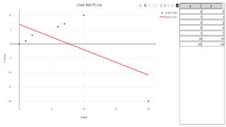
The following plot is generated, with the blue markers representing the scatter data and the red line showing the best fit:
The result is a simple yet powerful demonstration of how EJS can leverage external libraries like Plotly to visualize data dynamically.
Conclusion
This example showcases how the integration of EJS and Plotly enables the creation of interactive visualizations that enhance learning. By allowing real-time interaction and the ability to visualize trends like linear regression, educators can provide students with more engaging and effective tools for understanding data analysis. This combination can be especially useful in fields like physics, mathematics, and engineering, where real-time data visualization plays a critical role in learning.
Stay tuned for more examples of how to extend the power of EJS simulations with other JavaScript libraries!
Research
[text]
Video
[text]
Version:
Other Resources
[text]
end faq
{accordionfaq faqid=accordion4 faqclass="lightnessfaq defaulticon headerbackground headerborder contentbackground contentborder round5"}
- Details
- Written by Loo Kang Wee
- Parent Category: Probability and Statistics
- Category: 6 Probability and Statistics
- Hits: 1291


